TlotlisoTlotliso
MorethiMorethi

Clicks

Optimising Clicks' healthcare booking experience

Discipline
Design
Year
2024
Role
UX/UI Designer
Client
Clicks via MakeReign
Status
Launched

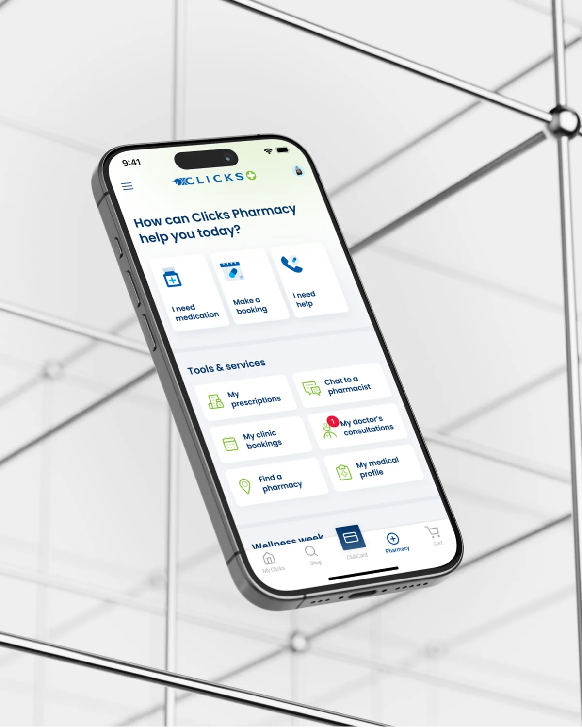
Usability testing on two Clicks app journeys, clinic bookings and online doctor consultations. I wrote the scripts, ran the sessions, and turned three findings into a redesigned booking flow that is now live.Usability testing on two Clicks app journeys, clinic bookings and online doctor consultations. I wrote the scripts, ran the sessions, and turned three findings into a redesigned booking flow that is now live.
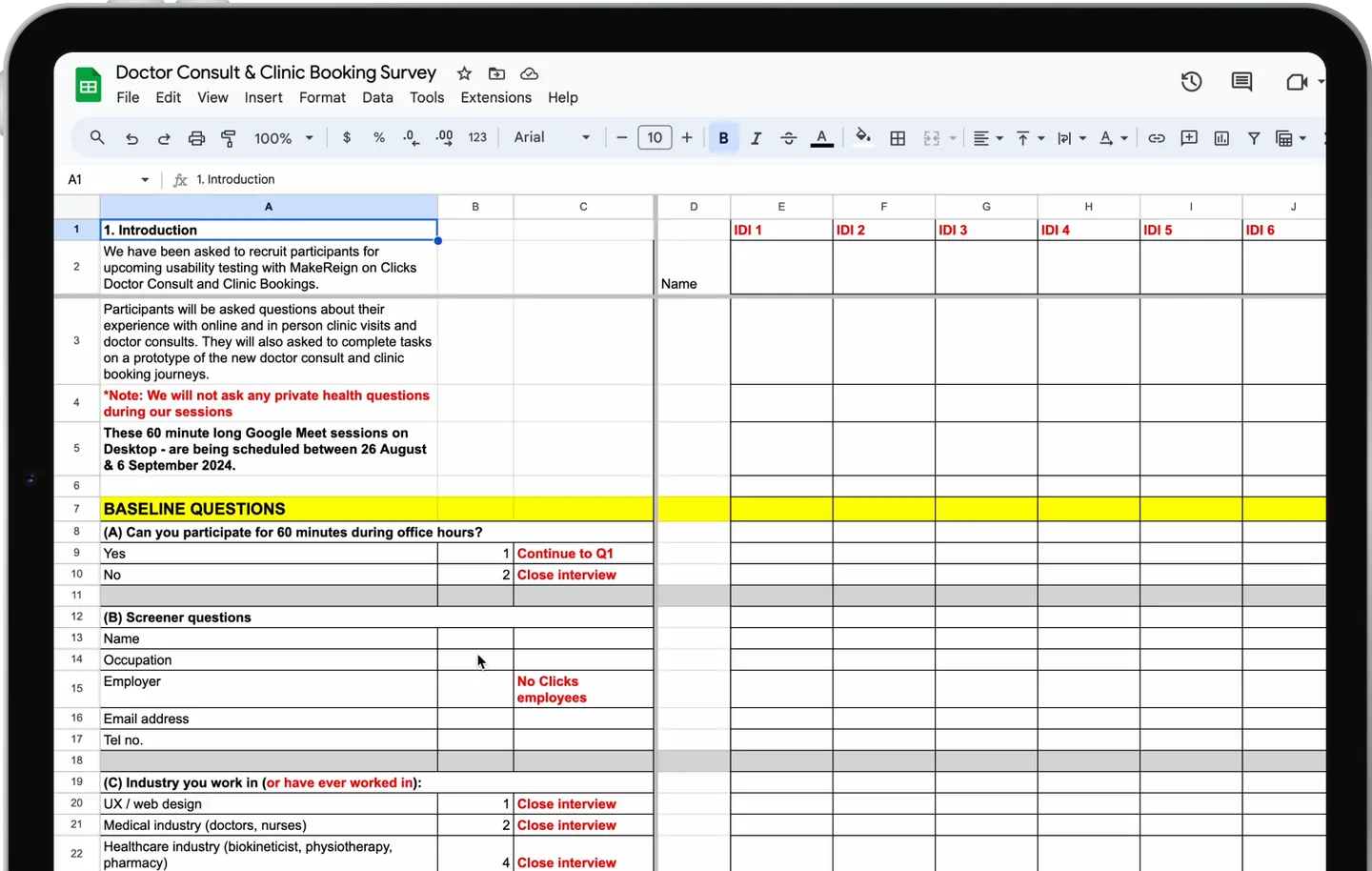
The screener, with close-out rules for each answer
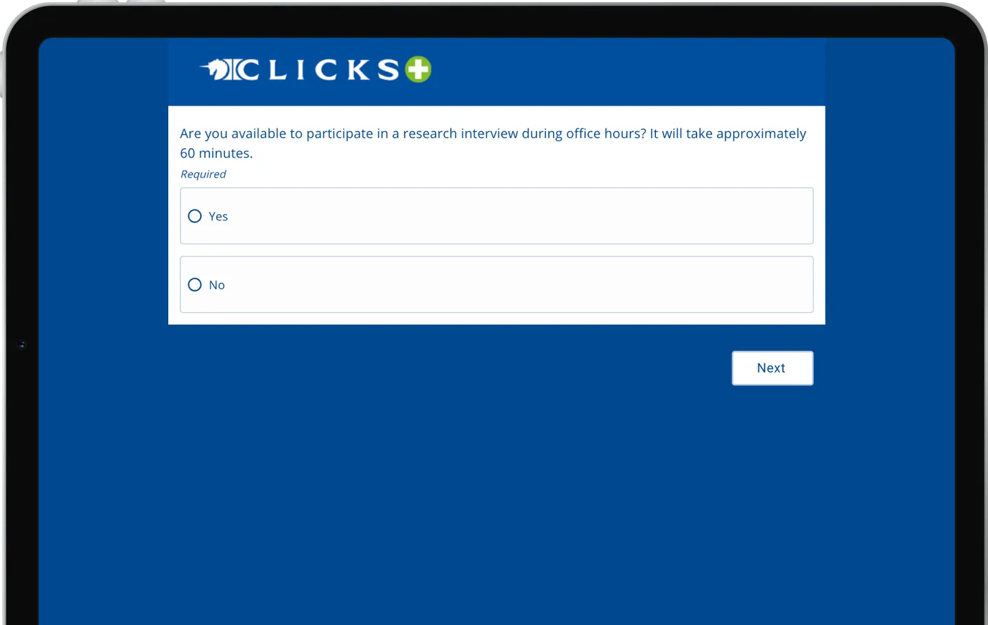
The screener as Clicks customers received it
01.The screener, and how customers received it
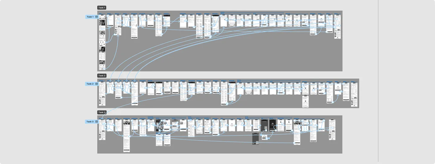
The wireframe prototype of the booking journeys, one row per task
02.The prototype, one row per task
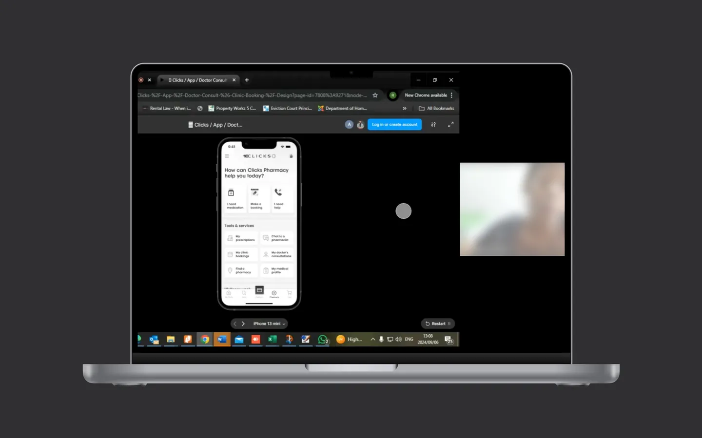
A recorded remote testing session, participant blurred
03.Remote sessions, recorded
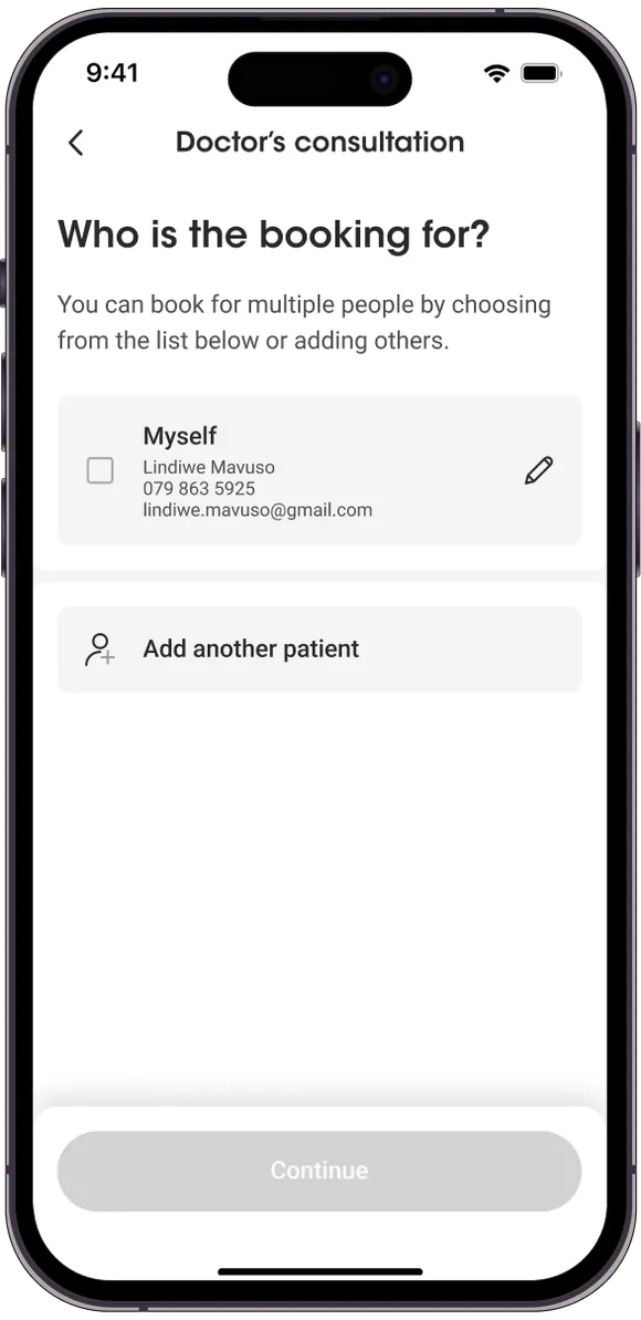
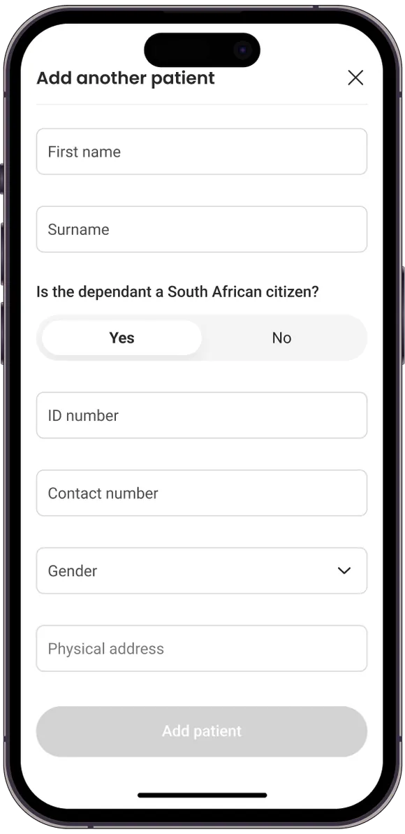
Tested screen: who is the booking for, with Myself and Add another patient
Tested screen: the Add another patient form
Tested screen: who is the booking for, with Myself and Add another patient
Tested screen: the Add another patient form
04.Tested. Parents booking for their children

In testing, parents preferred to book under their own details rather than add their children as dependants.

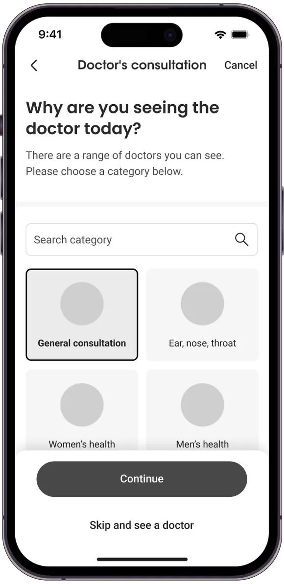
Tested screen: choose a category before seeing a doctor
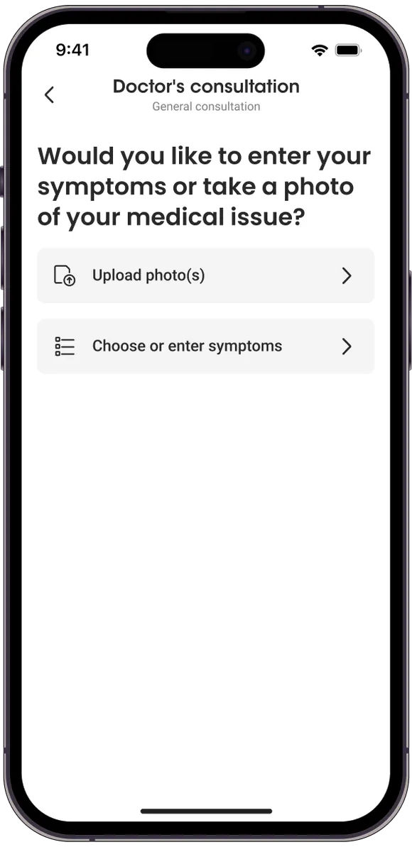
Tested screen: enter symptoms or upload a photo, before a doctor is chosen
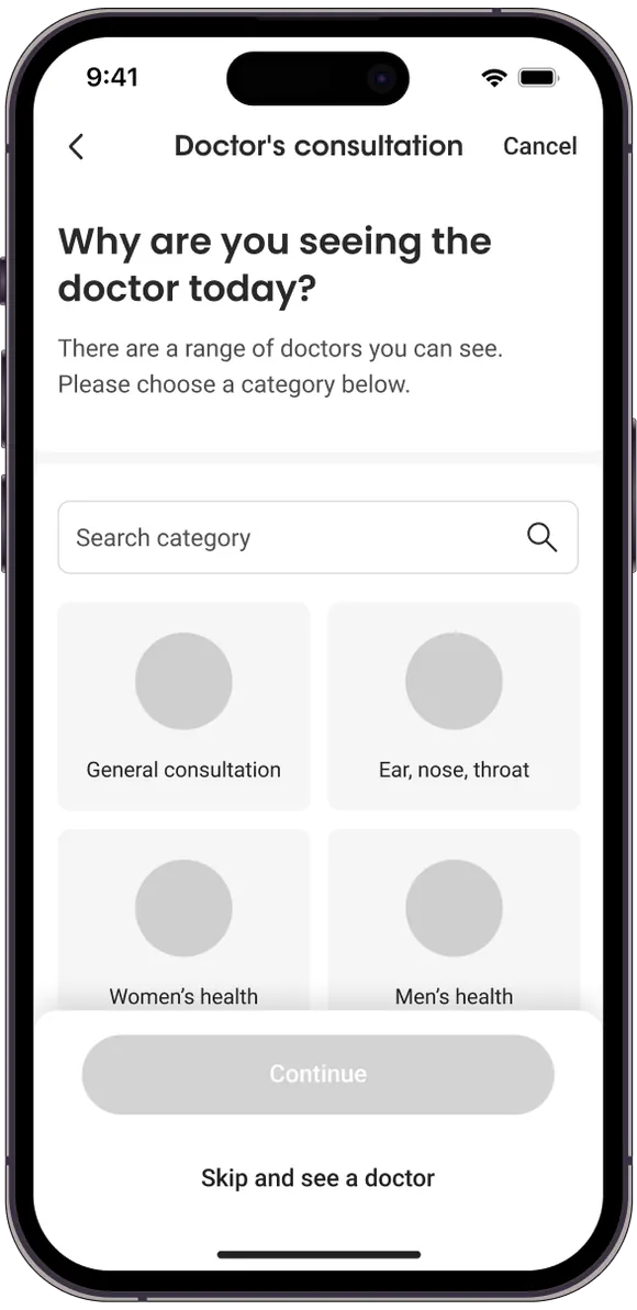
Tested screen: consultation categories including Ear, nose, throat and Women's health
Tested screen: choose a category before seeing a doctor
Tested screen: enter symptoms or upload a photo, before a doctor is chosen
Tested screen: consultation categories including Ear, nose, throat and Women's health
05.Tested. Symptoms before a doctor, and categories read as specialists

People hesitated to share symptoms before choosing a doctor, and read categories like ear, nose and throat as specialists rather than GPs.

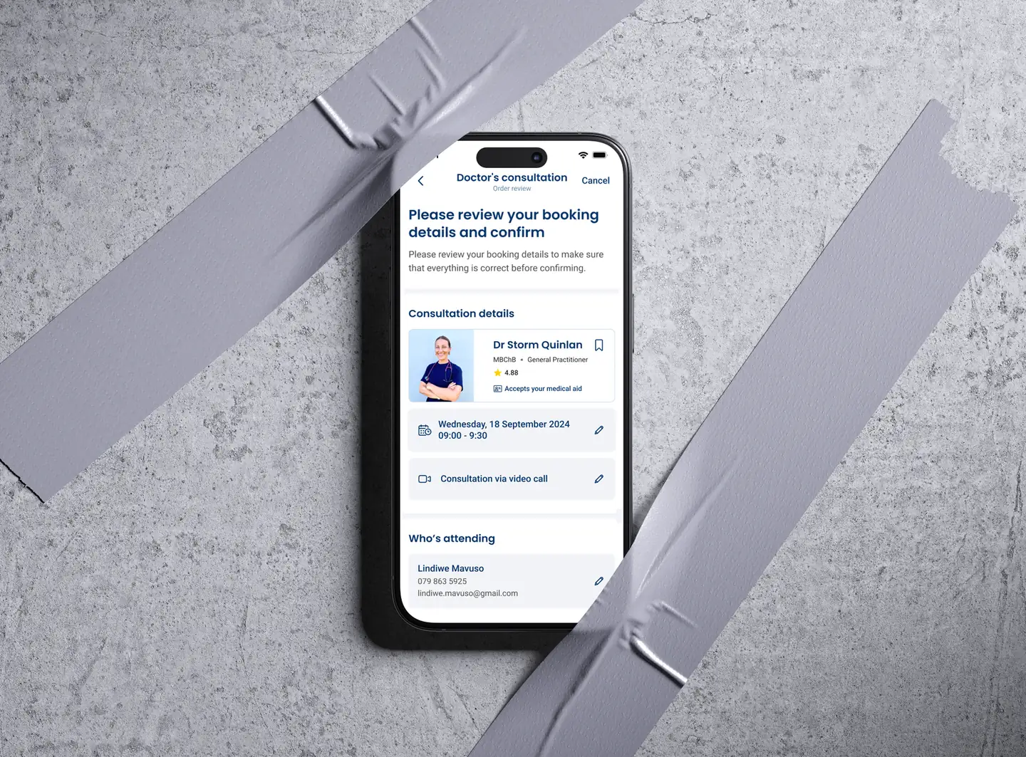
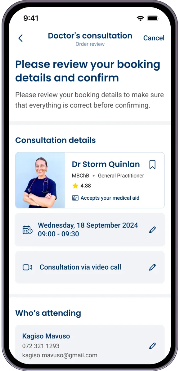
The redesigned review and confirm screen
06.The redesigned review and confirm screen

Everything is checked in one place before confirming: the doctor, the time, how the consultation happens and who is attending, each with its own edit.

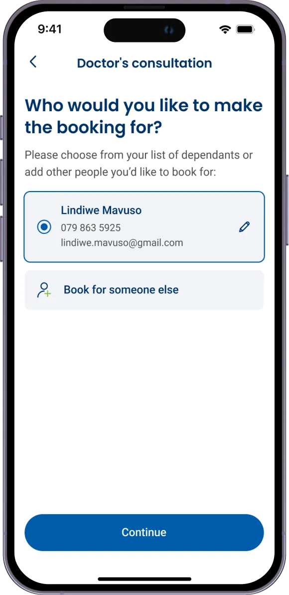
Redesigned screen: who would you like to make the booking for, with Book for someone else
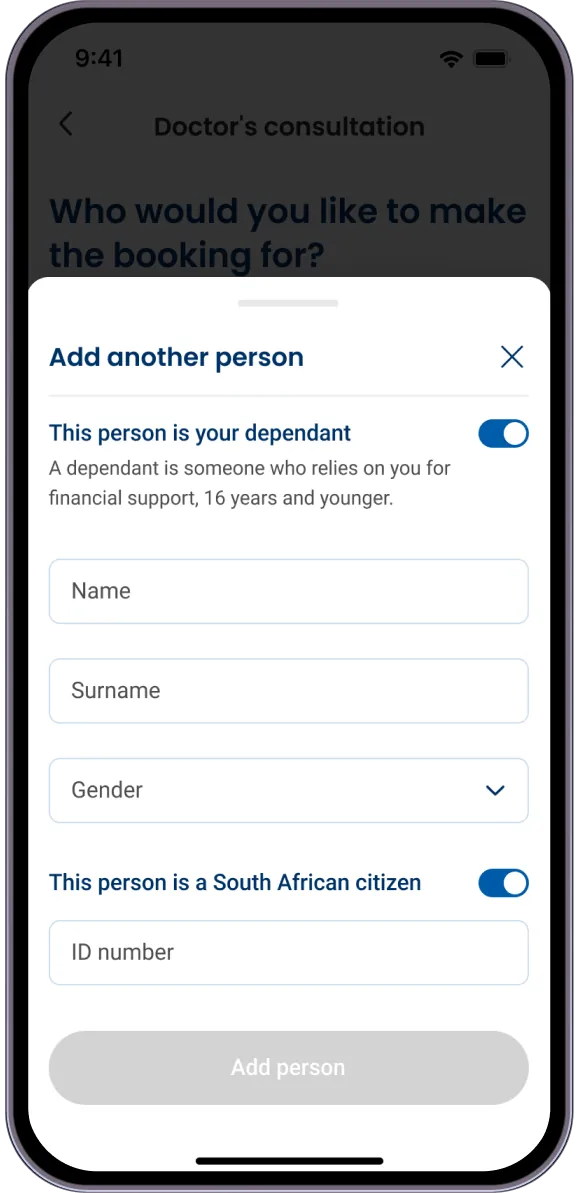
Redesigned screen: Add another person, with a dependant toggle
Redesigned screen: who would you like to make the booking for, with Book for someone else
Redesigned screen: Add another person, with a dependant toggle
07.Redesigned. Book for someone else

A clear Book for someone else, and a dependant toggle that cuts the form down, so parents can add their children without the extra steps.

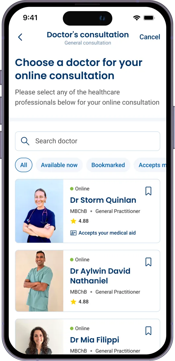
Redesigned screen: choose a doctor for your online consultation
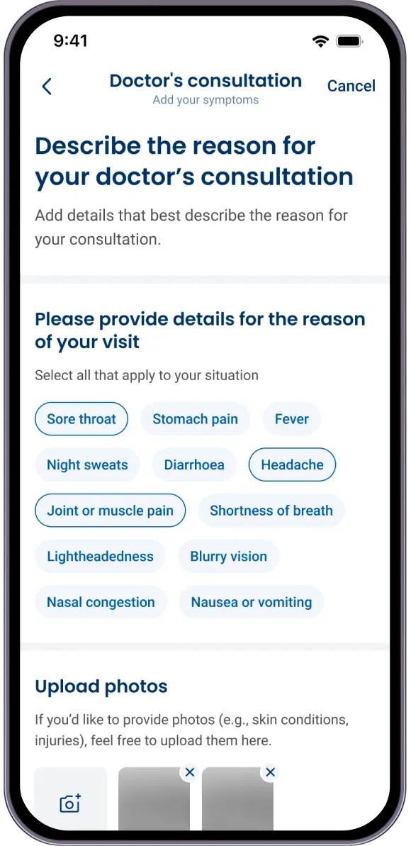
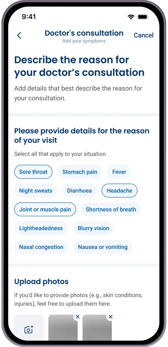
Redesigned screen: describe the reason for your doctor's consultation
Redesigned screen: review your booking details and confirm
Redesigned screen: choose a doctor for your online consultation
Redesigned screen: describe the reason for your doctor's consultation
Redesigned screen: review your booking details and confirm
08.Redesigned. The doctor first, then symptoms

The doctor comes first now. Symptoms are shared only after someone has committed to a GP, and stay private until the call starts.

Redesigned screen: select the reasons for your visit, or upload photos
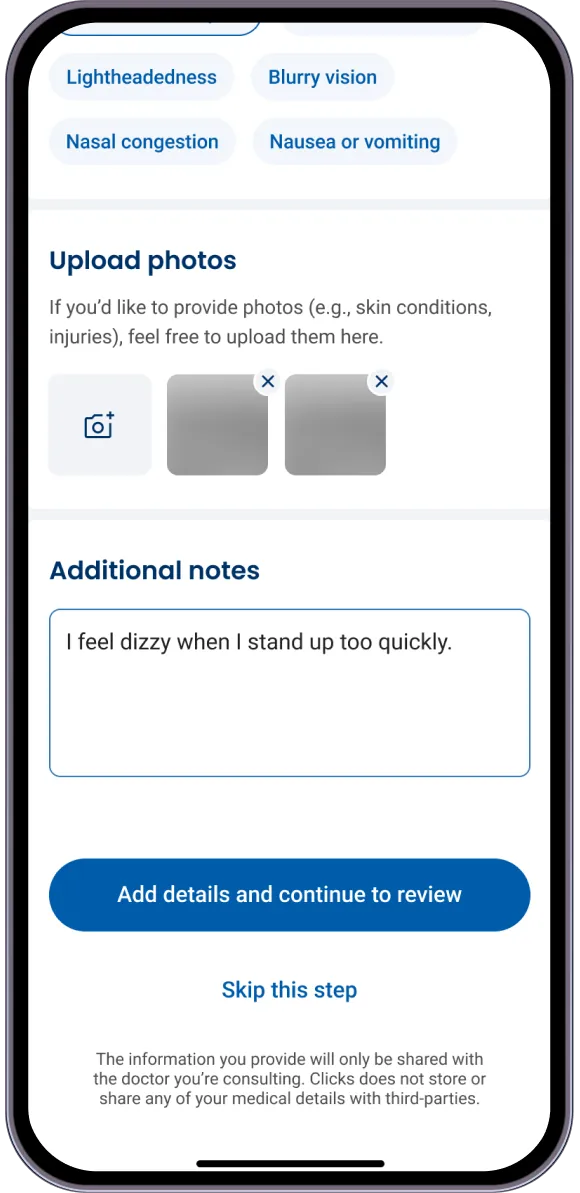
Redesigned screen: additional notes, with an option to skip the step
Redesigned screen: select the reasons for your visit, or upload photos
Redesigned screen: additional notes, with an option to skip the step
09.Redesigned. A reason for the visit, not a category

The category screen is gone. People pick a reason for the visit, like a sore throat, or skip the step entirely.

Next caseViewSantam
TlotlisoLM

What would you like to know?

AI in my voice · It can be wrong

Tlotliso MorethiLoading
000